Canvas Size
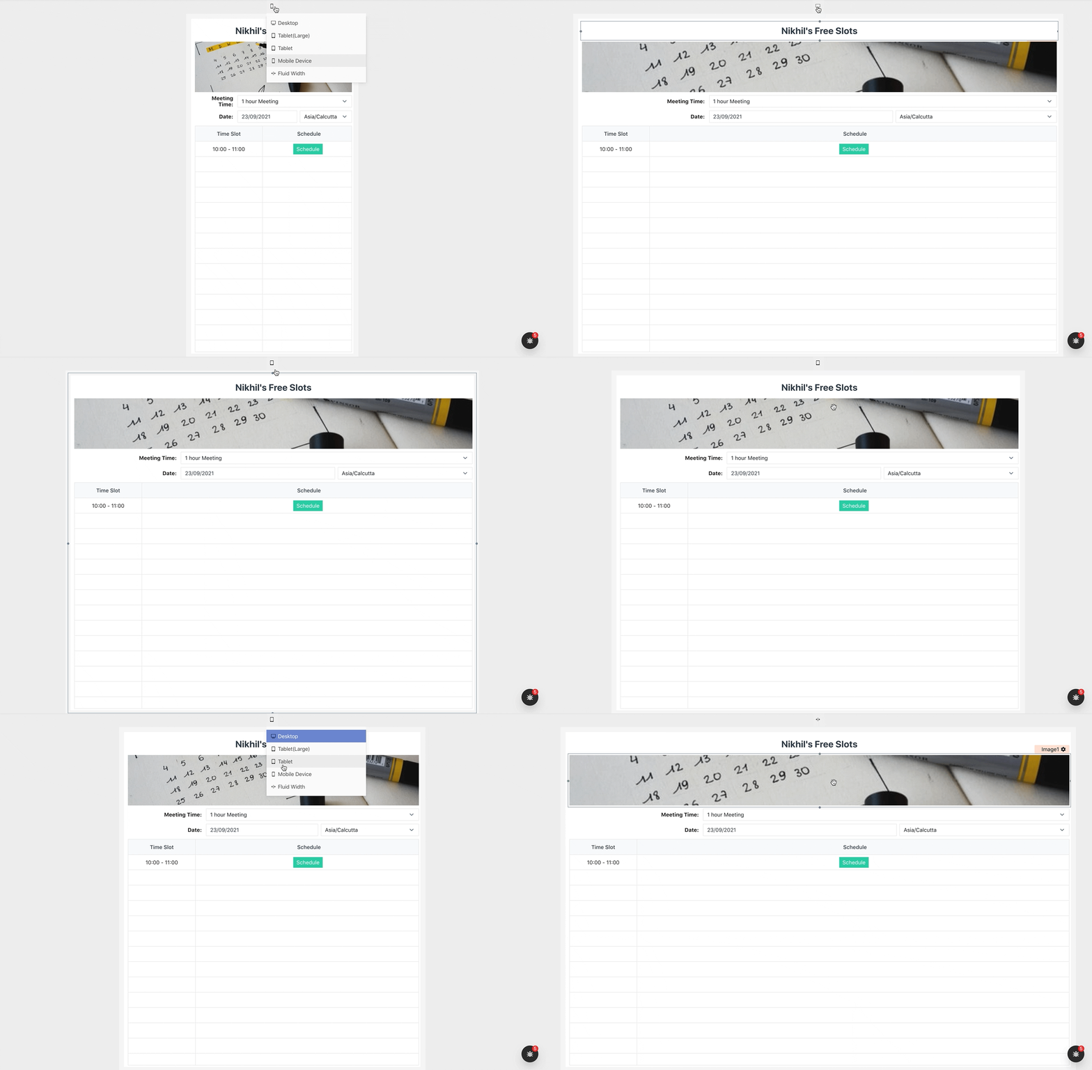
The Application layout can be selected to match the Application size to the device it is intended for. The desktop layout is set by default for an application.
How it works
For an application layout that has a Min-Max width limit, The application fills the browser's width until the browser width is not Greater than the maximum width of the layout chosen. When it exceeds the maximum width of the layout, the additional width is filled by whitespace. The application doesn't squeeze below the minimum width of the layout chosen and would show scrolls if the browser width is less than the minimum width of the layout chosen.
In the case of Fluid, The application fills the browser's width.
At any point in time to change the application layout, click on the Layout control present on the top of the canvas and select a layout to use.

Changing the layout for an application changes the layout of all pages of the application.
Supported Layouts
- Desktop (Application width would resize between 1280px - 1160px)
- Tablet L (Application width would resize between 1080px - 960px)
- Tablet (Application width would resize between 800px - 650px)
- Mobile Device (Application width would resize between 450px - 350px)
- Fluid (Application fills up to the Browser Width)
